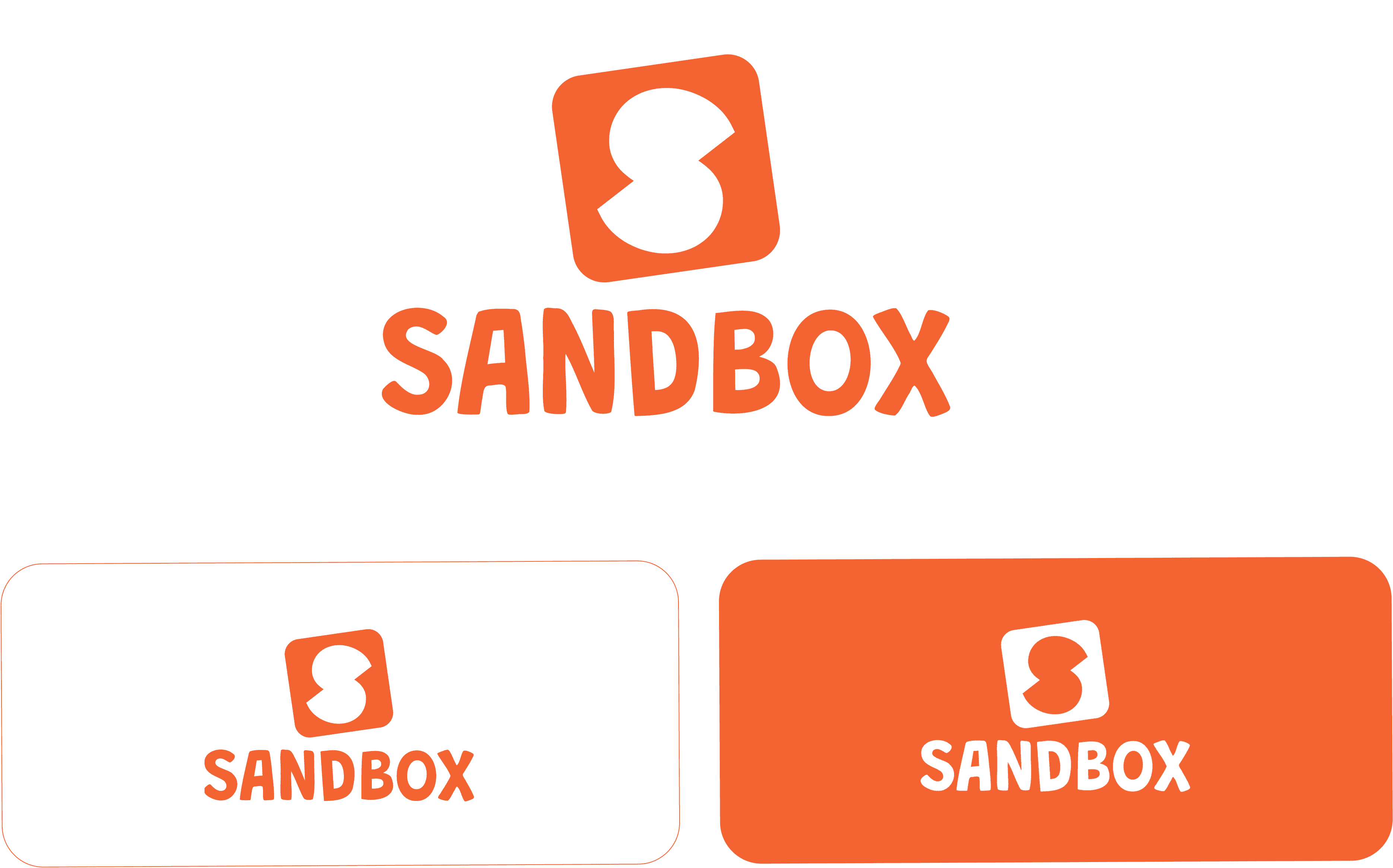
Sandbox
Branding
Client:
Sandbox Educare Pvt Ltd
Scope:
Branding
Year:
2025
OVERVIEW
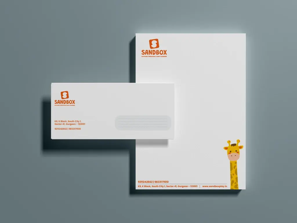
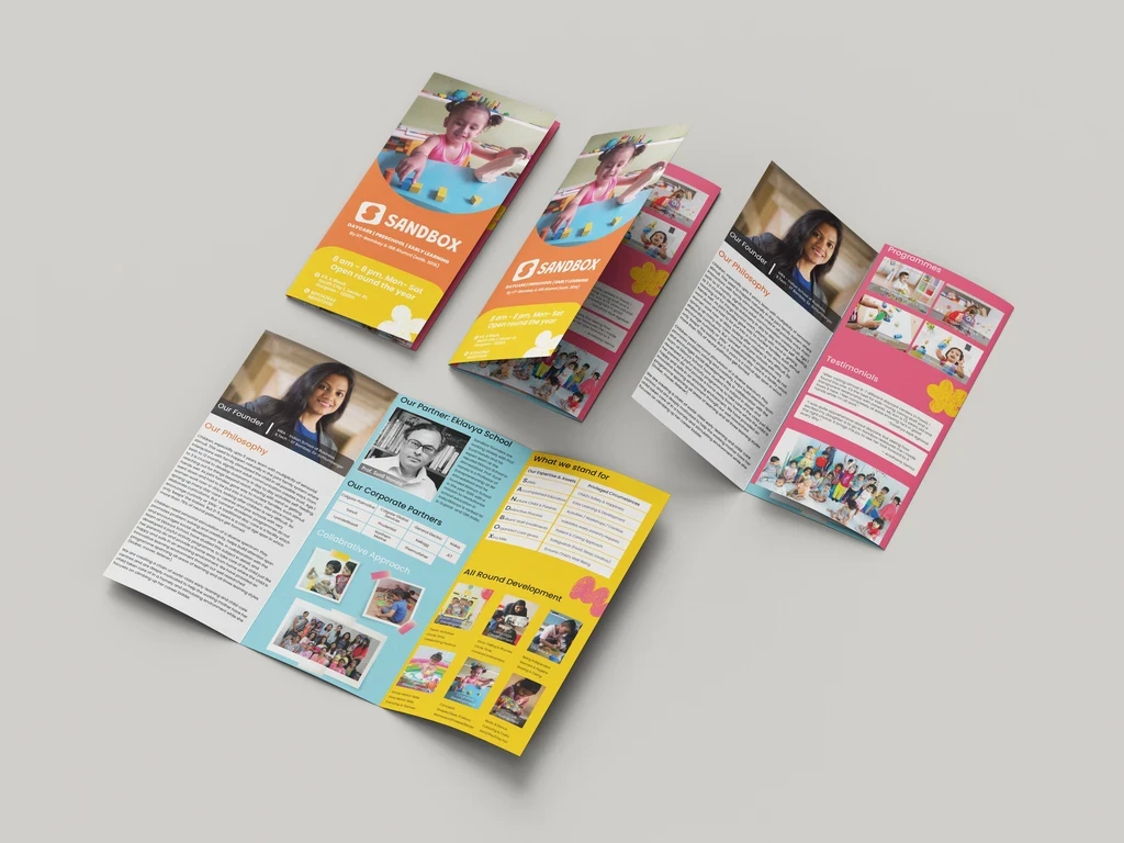
We crafted a brand identity for Sandbox Educare that reflects the warmth, curiosity, and imagination of the children it serves. From the logo to the overall visual language, every element is playful, welcoming, and dynamic—designed to inspire exploration and make learning feel like a joyful journey.